
By Andy May
The simple answer is that the portion of the ocean, roughly 54%, that has HadSST values is getting cooler. But Nick Stokes doesn’t believe that. His idea is that the coverage of the polar regions is increasing fast enough that, year-by-year, the additional cooler cells are causing the “true” upward trend in ocean temperature to decrease. I decided to examine the data further to see if that makes any sense.
First, let’s look at the graph in question in Figure 1. It is from our previous post.

Figure 1. This post shows the global average temperature for the portion of the ocean covered by HadSST in that year. Both the HadSST temperatures and the ERSST temperatures are shown, but the ERSST grid values are clipped to the HadSST covered area.
As we discussed in our previous posts, the populated HadSST grid cells (the cells with values) have the best data. The cells are 5° latitude and longitude boxes. At the equator, these cells are over 300,000 sq. km., larger than the state of Colorado. If Nick’s idea were correct, we would expect the cell population to be increasing at both poles. Figure 2 shows the percentage of the global grid (including the 29% with land) covered with populated SST (sea-surface temperature) cells by year. The number of missing cells doesn’t vary much, the minimum is 44% and the maximum is 48%. There might be a downward trend from 2001-2008, but no trend after that. Figure 1 does flatten out after 2008, but you must work hard to see an increase from 2008 to 2018.

Figure 2. The number of monthly null cells in the HadSST dataset, as a percent of the total global monthly cells per year (72x36x12=31,104).
So, mixed message from that plot. Let us look at the nulls by year and latitude in Figure 3.

Figure 3. The number of monthly nulls, by year and latitude.
Figure 3 shows that the nulls in the polar regions are fairly constant over the period from 2001 to 2018. I’ve made 2018 a heavy black line and 2001 a heavy red line so you can see the beginning and the end of the series more clearly. The real variability is in the southern Indian, Pacific and Atlantic Oceans from 55°S to 30°S. These are middle latitudes, not polar latitudes. Neither 2018 nor 2001 are outliers.
The same pattern can be seen when we view a movie of the changing null cells from 2001 to 2018. Click on the map below to see the movie.

Figure 4. Map of the number of monthly null cells in the HadSST dataset for the year 2001. To see where the null cells are in all the years to 2018, click on the map and a movie will play. As before, the white areas have no null months in the given year, the blue color is either one or two null months and the other colors are more than two null months. Red means the whole cell is null.
Conclusions
The number of null cells in the polar regions does not appear to change much from 2001 to 2018. The changes occur in the southern mid-latitudes. The number of null cells, as a percentage of the globe, does decline a bit from 2001 to 2008, but only from 48% to 44%, not enough to reverse a trend. After 2008, there is no trend in null cells. From 2008 to 2018, the temperature trend is flat, and not decreasing, but given where the number of cells are changing, it is hard to say this is due to the number of populated cells in the polar regions.
The reader can make up their own mind, but in my view, we still have no idea what the global ocean surface temperature is, or whether it is warming or cooling.

I’m having a twitter conversation with the Hadley Centre’s SST expert, John Kennedy on this post. A key tweet is here:
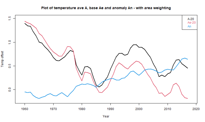
I’m a bit shocked at this admission, but some odd things I’ve seen make more sense now. Nick’s confusing comment with the plot below, from my last post, is now totally understandable. The actual was computed from the reference average and the anomaly, so if you subtract the reference average you get the anomaly. John and Nick are deep into circular reasoning here. I’m very disappointed.
Nick’s comment is here:
https://wattsupwiththat.com/2020/12/23/ocean-sst-temperatures-what-do-we-really-know/#comment-3151078